(Yes, the shape of your button matters. No, I’m not making this up.)

Let’s set the scene.
You’ve written the website. You’ve agonised over the headline. You’ve picked a photo where your eyes don’t look weird. You’ve spent six hours choosing between “Sage Whisper” and “Mossy Mistake” for your button colour.
And then… 🦗🦗🦗
Nobody clicks a single button *insert sobs.*
If your CTAs are sitting there gathering digital dust, it’s probably not your offer. It’s not your face. It’s not Mercury in retrograde.
It’s that your buttons are missing the small psychological levers that separate the best CTAs from the ones nobody clicks.
So what makes the best CTA?
Turns out it’s not about being clever, on-brand, or having the prettiest button on the page. It’s about 7 quiet little psychology tricks that high-converting websites use on repeat.
Here they are.
(Steal liberally.)
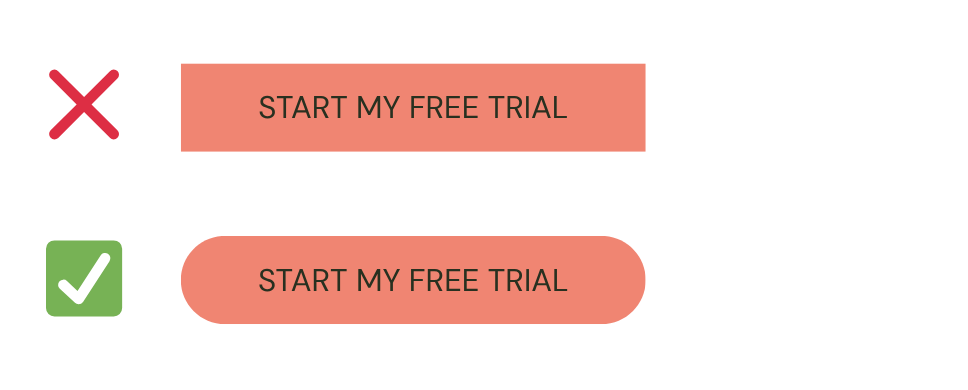
1. Round the edges of your buttons
Humans aren’t biologically into sharp edges. (Knives, daggers, paper cuts…)
Rounded corners, on the other hand, pull the eye gently towards the text in the centre of the button…which is the bit you actually want them to read.
2. The best CTAs skip the cute. They’re a clear command.
I know, it hurts.
I’m a personality copywriter and I’m telling you to be boring on your buttons.
But studies consistently show that the best CTAs are clear, command-style ones – and they out-perform clever buttons almost every time.
Your hero headline can be witty. Your sub-headline can sparkle. But your button needs to tell the reader exactly what happens when they tap.
Example (don’t click!) ⬇
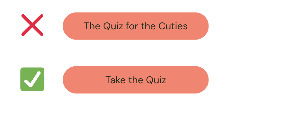
Save the personality for the words around the button. The button itself? Direct, clear, command. That’s the job.
3. Use personal pronouns
A Sales Lion study showed a 90% increase in click-through rate when buttons used personal pronouns instead of generic verbs.
Example (don’t click!) ⬇
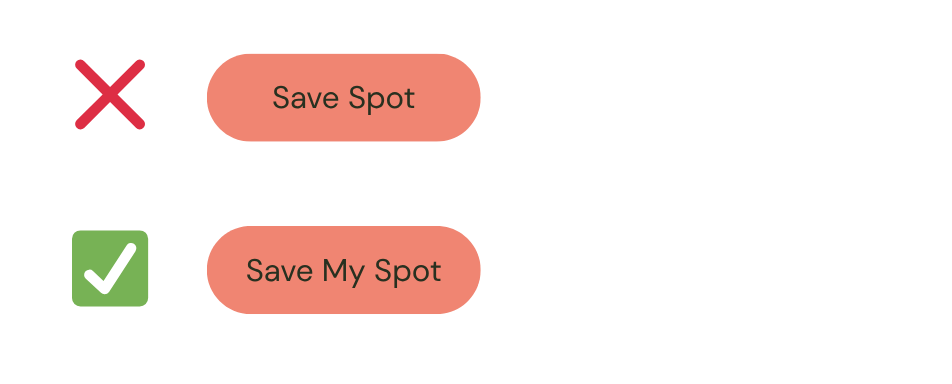
“My” turns the button into something the reader is doing for themselves, not something being demanded of them. It’s a one-word change. It’s literally a 90% lift in clicks.
This is the laziest, highest-leverage tweak on the list.
4. The best CTAs don’t blend in
Designers, look away…this one’s going to upset you.
A CTA that visually clashes with the page gets clicked more than a beautifully harmonious one. Think of the green EXIT sign in a cinema…it doesn’t blend, and that’s the point.
It needs to grab you.
Your button should have contrast. Loud, “I don’t quite match the vibe” contrast. The colour palette doesn’t need to be friends with the button. The button needs to be findable in a glance.
If your designer cries, tell them I started it.
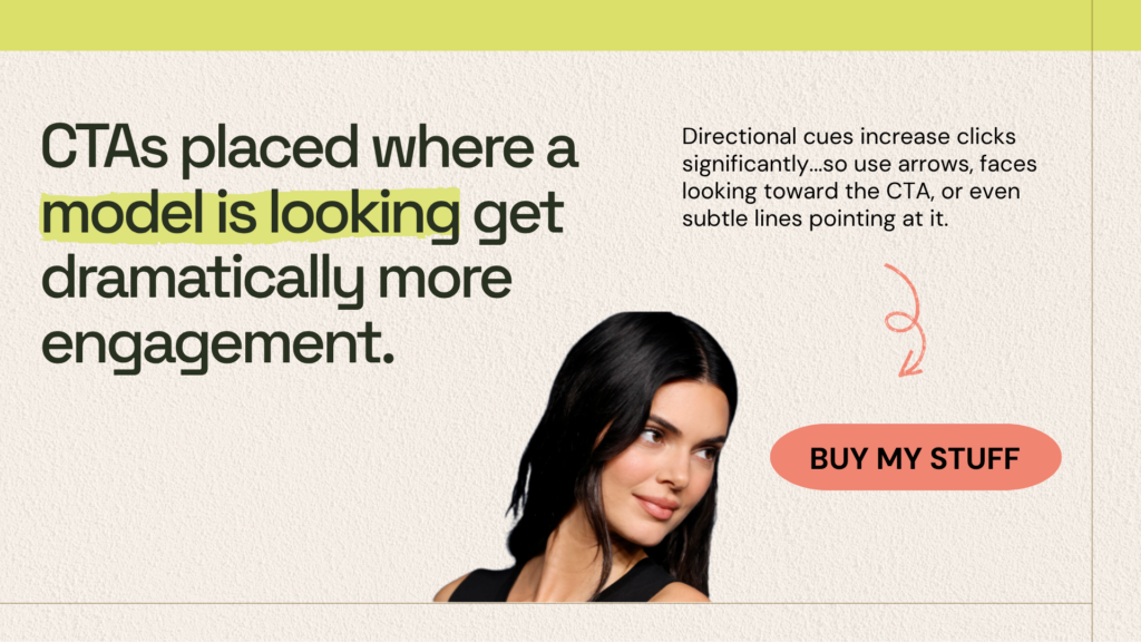
5. Point at your CTA (literally)
This is one of those neuro-marketing tricks that sounds too simple to be real, but the data is wild.
If there’s a model on your page, the reader’s gaze naturally follows where the model is looking. So if you’ve got a portrait photo on your landing page and her eyes are gazing into the distance for ✨ aesthetic reasons ✨, you’re sending the reader’s attention straight off the page.
Instead, place your CTA where the eyes (or hands, or arrows, or even subtle lines) are pointing. Directional cues significantly increase click-throughs. Make the visuals work for the button.
6. Reframe your CTAs for low commitment
“Buy” and “Purchase” feel heavy.
Even if your offer is $9 and even if it’s free.
At top-of-funnel – first touch, cold traffic, hesitant browser – words like “Start” and “Try” outperform “Buy” or “Purchase” by a noticeable margin.
Why? Because they make the click feel low-risk. There’s an implied back-button. They’re trying it, not committing to it.
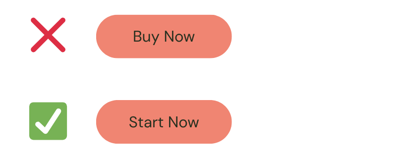
Save “Buy” for the checkout page where they’ve already mentally committed. Top-of-funnel needs to feel soft. Like sliding into a warm bath, not signing a 30-year mortgage.
7. (Bonus) Steal the rest of my homepage tricks
If you want more psychologically-backed ways to optimise your website – I HAVE A THING FOR YOU!
I made a (very thorough, very free) guide called “How to Write a Homepage That Makes You Money”, and it walks you through every section of a homepage that actually converts, with examples, formulas, and the kind of psychological cheat codes you just read above.
Grab the homepage freebie here →
Hey! Marisa here. Lover of naps, cheese + crackers, and leaving parties early. I’m also a creative copywriter, and I write interesting words to make brands money. Want me to write some for you?

Hey! Marisa here.
Lover of naps, cheese + crackers, and leaving parties early. I’m also a creative copywriter, and I write interesting words to make you money.
‘Cos money feels good, right?


Comments +